Posts

Showing posts with the label Paint

Year-End Re-cap...

Image
Well, it's been a while.  We made it through Halloween, Thanksgiving and Christmas with lots of fun memories.  The 31 Day Challenge took it out of me, I must admit.  Challenging it was for sure.  Lots of debate in my head was going on about continuing to blog or not but I decided I don't really need to make a decision, I can just do it when the mood hits.  So here I am with my year-end re-cap.  I have a love/hate relationship with these re-caps - I love the idea of looking back on the year - seeing what was popular with readers, what was a dud, looking at the pictures I took, getting re-inspired, etc.  But I hate them because I think they're kind of a lazy way to create a new post. So, here goes, some of my most popular posts of 2013: The first day of any 31 Day Challenge is always a biggie and this year was no exception. The overview of 31 Days of Making your House your Home can be found here.  This is where all the other 31 Days posts ca...

Day 20 - Making your House your Home - To Paint or Not to Paint...

Image
In fourteen years I've painted all of our rooms - some of them more then once.  So, I would always say 'yes' to painting.  I'm of the school that says 'it's paint, if you don't like it you can paint it again.' Paint is probably the number one way to make your house your home, to make your home express your personality.  Your walls may be white or blue or green or beige.  Whatever color you choose, you'll be saying volumes about your personality and lifestyle. One of my favorite blogs is Favorite Paint Colors . There are tons of different paint colors that you can actually see in use in people's homes.  It's great inspiration and just fun to look at. This is part of my 31 Days series . The rest of the posts can be found here.

Day 11- Making your House your Home - Kids' Bedrooms...

Image
Pottery Barn Kids When we find out we're expecting that first baby our minds go to the fabulous nursery we will create for him or her, sparing no expense obviously.  We register for the best of everything & if we're lucky we get some of it.  Everything matches - the bedding, the walls, the rug, the window treatments - everything.  Sometimes we make a compromise when we get a crib handed down from family - it might be brown instead of white but it's a family heirloom for our precious babe.  Weeks before the birth we have the room ready for our new bundle.  Baby comes home to the glorious - just for her - room.  The place we rock and feed our little one. The months and year pass, toys get added into the mix - lots of toys and that precious room changes just a wee bit..... Real Simple If you're like most of us your children's rooms have looked better than this and also worse (although we probably haven't taken pictures of the worse!) What's...

White...

Image
Coastal Living I have spent years painting our house.  Almost 14 years to be exact.  It's a never ending task, I suspect.  I have recently decided that most of my colored walls will eventually be some shade of white. Our house is kind of dark due to window placement which in the summer is a big benefit as it gets so warm  hot here. But I am feeling the need to brighten things up around here and white seems just the ticket. Anyone who's done any painting knows that painting something white is no easy task as there are approximately 8 million shades of white to choose from.  I am currently in the looking/paint chip/paint sample stage and have narrowed the choices for my kitchen/dining area down to no less than 8 options. Stay tuned...

Update: Front Door

Image
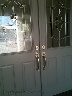
I painted our front door.  I talked about doing it in this post .  And here is the end result: I used Valspar (Lowes) exterior paint with primer custom mixed to a Sherwin Williams color - Summit Grey. (Please excuse the command hooks on the glass-I am debating putting up another wreath and decided to keep them up until I make my decision - classy, yes?) I think I like the color with the house but part of me thinks I should have gone with a warmer grey to better complement the cream color (Sherwin Williams Muslin).  I think a little accessorizing will take care of that. Love how it works with the brushed nickel hardware. Many thanks to everyone who 'voted' on their favorite color! I'm linking up to Hooking Up with HoH @House of Hepworths,  Frugal Friday at The Shabby Nest & Weekend Bloggy Reading at Serenity Now &  Show and Tell Friday at My Romantic Home..

The Front Door...

Image
I am debating painting my front door.  This debate has been going on in my head for a while and I think I've finally decided that I should do it.  The big question now is: what color ? I would love something like this..  But in keeping with the local architecture it will never happen. The doors we have now are similar to this but painted a cream color (Sherwin Williams Muslin).  Source I kind of like this green door (Sherwin Williams Edamame) .  Our house is a bit lighter and not quite this southwest looking but I think this color would work. Source Of course, there's always black - which was my first idea.   I'll be out getting swatches tomorrow and hopefully I can make a decision before it gets too hot to paint. I'd love to hear your front door paint color ideas, too.

Pottery Barn Knock Off - Easter Flag

Image
I saw a cute burlap Easter bunny flag in the Pottery Barn a while back for $39 (it is no longer available).  I didn't think the price was too bad but I knew I could make something similar and just as cute. Pottery Barn  I actually ended up making two of these - one using burlap and one using drop cloth.  And I added a cute pom pom tail to both.  I made the hanging rod with a dowel and two finials painted black to resemble wrought iron. For the drop cloth bunny I painted the bunny (I just Googled 'bunny silhouette' and picked out a bunny, printed it and traced around the bunny on the drop cloth with chalk.) I sewed the edges, making a pocket for the rod.  I added a bow to the neck, a button for the eye and the pom pom for the tail. Here's the burlap bunny. I traced the bunny freehand on white flannel and sewed it on the burlap. I used the same type of dowel/finial for the rod. I added a pom pom for his tail, too. I ha...

XO

Image
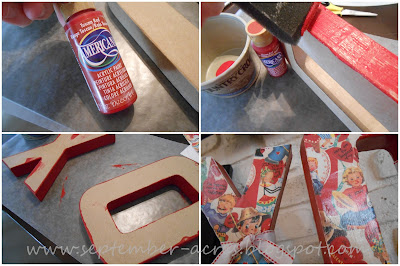
Over the weekend I worked on my version of the 'XO' letters I saw at Tatortots and Jello .  I fell in love with the vintage looking Valentine paper at Hobby Lobby and knew that's what I would use for these letters - even though it was nothing like what I had in my head.  I painted the sides with red craft paint (Tuscan red, that is) instead of using a different paper as I originally had planned.  I mod podged the paper after painting the sides and added some ribbon & a glitter mini-clothespin (which I got at our now closed Michaels). This is a super easy project and one that the kids can be involved in as well.  It took me about 30 minutes to complete plus drying time (which wasn't more than another 20-30 minutes here in dry Arizona).  And the possibilities for colors, letters and accessories are endless.  It goes way beyond Valentine's Day. Initials for new babies or birthdays. 'Hop' or 'Egg' for Easter. 'Love' for a weddi...

12 Most Popular Posts of 2012

Image
As the year comes to an end, I always like to look back to see what I worked on over the year and what themes or ideas were popular here at September Acres.  I love reading year in review type posts and there are a ton of them out there right now.  I hope you will enjoy reading (or re-reading) my most popular posts from this past year. 31 Days of Organization-Day 1 - This is where the series starts.  It has links to all of the posts for the month (a few of them are also on the top 12 list). Home Management Notebook - Also part of the 31 Days series.  The notebook has been such a useful tool for me. DVD/CD Storage - Even with MP3 players and the like DVD & CD storage can be a bear.  This solution really helped keep our home looking a bit neater.  This was also part of the 31 Days Series. Organizing Basics - Yet another in the organizing series.   Key Lime Bar Recipe - We spent a week organizing our kitchens and I loved taking a break t...

Before and After - kitchen

Image
I was going through some old blog posts looking for some pictures of my kitchen before we re-did it a few years back.  I came across this one and my first thought was "That's my old kitchen.  I can't believe I lived with it like that."  Isn't it funny how our taste evolves over the years? This is the before. Yuck. This is what it looks like now.  Cabinets painted, new counter tops, new back splash, under cabinet lighting (maybe it's just as well we didn't have that before).  Hard to believe it's the same room.  Here's the entire post on the backsplash reveal .  You'll notice the wall was brown, not yellow, before we put in the back splash.  We painted it after the cabinets were painted and the counter tops were replaced. I sure do like my new kitchen better.  You agree, don't you?

Painting Rocks...

Image
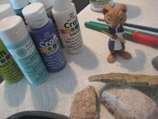
One of the things we wanted to do this summer was to paint rocks.  Just for fun really.  And living in the desert we have lots of rocks right outside our door.  So today was the day.  LM headed out after lunch to pick out a few rocks and I gathered up the paint and brushes. Paint supplies & rocks.  And the rabbit from "Hop".  Wonder how he got there? I painted one rock for us to keep.  I used rubber stamps and ink to make a little design.  I kind of like it! LM painted a rock for her Grandma who just had open heart surgery in June.  Luckily she picked a small one so it won't cost an arm and leg to mail it. I packaged it up in a cellophane bag with some shredded paper.   I think Grandma will love it! This activity is really fun, creative and very frugal.  Here's what we used: Rocks from the yard Craft paint Paint brushes Rubber stamps  Stamp pad I keep old yogurt containers and the like to p...

Shades of Grey...

Image
I finally painted our guest bath over the weekend.  After much deliberation over which shade of grey to use  , I ended up with 'Silver Leaf' by Valspar.  It's a bit lighter than the 4 original shades I was considering but I really like how it turned out.  It's actually the same color my husband used for his work office.  There was quite a bit leftover from that so I decided to use it and hope for the best.  You know me, always looking for a chance to save $$$! It turned out to be a good decision. Here's a look at the finished room: I wasn't sure how this print, with it's green mat and frame, would look on the wall but it looks really nice.  Actually, it looks better in real life than in this picture.  The grey-ish white of the rocking chairs ties in with the wall color quite nicely. The galvanized, numbered pots work well with the grey walls. This little bath was the last room in the house to be painted.  No...

Pool Table...

Image
I finally got around to repainting this little table that sits by the door going out to the pool.  Affectionately called the 'pool table' due to the fact that it houses sunscreen and towels for the pool, the table sits within reach of the doorway so we can pick up our towels on the way out. Or reach in without making a mess if we forget them. My dad made this table many years ago when 'country' was a big design style.  I've had it in many rooms through the years but most recently in the garage because it didn't really have a 'spot' due to the style.  I knew I had to either use it or give it to someone that would so I decided to spruce it up a bit and bring it into the 21st century.  The biggest obstacle to an update was the heart cut out.  Cute in the 80's; not as much in 2012.  And while I'd like to say that I came up with the brilliant idea to cover the heart with the medallion, it really came from Wendy over at The Shabby Nest when she h...

Decision time...

Image
Well, I'm ready to get painting around here.  First stop, the hall bath.  A while back I wrote a post about my decision to paint this room grey.  Just like every color under the rainbow, there are a zillion shades of grey so while I made the grey decision I still needed to decide on which grey.  Light, dark or somewhere in between? I headed to Lowe's and narrowed it down to these four shades: I think I know which shade I am leaning toward but I'd love to hear your ideas.  If you haven't seen the room in it's current state you can see it here .   So, what do you think? 1,2,3 or 4?  Let me know!  Thanks!

Grey...

Image
With the exception of our hall bath , every room in our house has been painted since we moved in 13 years ago.  I think I'm ready to tackle that room (I use the word tackle very loosely because it's a really small room so I think I could finish up in an hour or so).  I think I've decided on grey paint.  I love grey right now and it will pick up the grey in the marble counter top. I'm not sure if I want to go with a light-ish grey like this. Image Or something darker like this. I think something lighter will work better in the room.  I like the darker grey but I think it's a little more modern and the bathroom is more cottage-y. So I'll do my usual 'go to Lowe's and bring home 5 or 6 paint swatches and tape them to the wall for a week or so' and figure out what I like. Do you have a grey that you've used and liked?

Painting Season...

Image
With the weather cooling down we are entering what I like to call 'painting season'.  It happens to coincide with football season so I am usually on my own.  But it's getting cool enough to open doors and windows for the day making it good weather to paint a whole room as opposed to a small piece of furniture or an accessory. I am thinking about painting the guest bath next.  We never painted the walls when we did the remodel .  I am really liking gray right now and I think that bath is the perfect place for the perfect shade of gray.  In the coming weeks I hope to carve out some time to look at some grays and see if I can find one for that room. I liked the grayish color Melissa used in her hallway. You can see it here .  She is actually having a giveaway for a $150 giftcard from Walmart so you can get your next painting project started.  Now there's some motivation!

How do you like me now?

Image
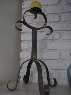
I bought this candle holder years ago, right after we moved to Arizona.  To be honest, I never really cared for it.  So I stuck it on our pot shelf, way up and out of the way.  I bought it because it was that rustic, southwest-y look that was so popular 10 or 11 years ago.  Even though it was not my style.  When I was redoing my pot shelf a week or so ago I took down that candle holder with the intention of donating it to the Goodwill.  But it's a great size; tall and kind of chunky.  I figured I would keep it but I still didn't like it.  Enter my friend, Krylon Blue Ocean Breeze spray paint.  I figured I'd give it a shot and see how I liked it after a couple of coats of this beauty.  I kind of like it.  Alot.  I should have done this years ago!  I stuck the red and white candle on top because the colors work but I am not wild about it.  I'll look around for something that I like better but for now it's so much bette...